Just why are Steamy Train Tales’ brand colours so different from the vast majority of other erotic fiction writers or erotic brands? Author B.R. Lee explains the rationale for these particular colours of smut.
So here’s the thing. Go onto your social media app of choice and check out some naughty writers or erotic retailers. Invariably, there’s going to be lots of reds, blacks, and greys being sported. Not only in the images that they’re posting but also in their brand identity (such as their logo). There’s no denying that the colours used are clichés (good ones though) as they’ve been intrinsically associated with love, lust, mystery and mischief throughout time, and especially in the digital age, colours of smut too.
However, when it comes to human cognition (yep, here’s the science bit) after shape, comes colour, and then bringing up the rear, text. With all those very similar looking red, blacks and greys, there’s not much in the way of differentiation. And that’s no good when standing out is crucial to have a chance of being noticed in the first place.
Blue and yellow are my chosen colours of smut for Steamy Train Tales. But why choose blue and yellow when conceiving all this back in 2021? They’re certainly different from the usual ‘sexy’ colours, so it ticks the ‘differentiation’ box for sure. But there’s method in the madness. And now it’s time to tell you why, so that you in turn can ponder whether the line between genius and stupidity is a very, very fine one indeed.
Before anyone can follow me on social media (and then, in the not too distant future, buy my saucy stories) they actually need to be aware of me and come across me in the first place. That’s not only a key marketing principle, it’s common sense. Leaving hashtags aside for a moment, how can I visually succeed in making a potential follower or book buyer aware of me when there are so many others competing in the same sphere?
Simple. When everyone else is zigging, I’m zagging.
When it comes to the colours of smut or erotica, kink and sexy sophistication in general, Instagram and elsewhere is festooned with reds, blacks, and greys (Christian or otherwise). Look on the hashtags or even individual accounts. It’s just all the same. And consequently really, really hard to make an initial visual impression that stands out if using the same visual elements as everyone else and their dog.
So when everyone else is using the same colours as everyone else, I’m doing the opposite. Blue and yellow are not at the top of anyone’s list of colours associated with naughty frolics. But when you put one of my posts into a 3 x 3 grid of nine images, and the other eight are consistently blacks, greys, and reds, who do you think stands out the most? My relatively gaudy imagery still offers no cast-iron guarantee that the post will be read. But it nonetheless offers me the best chance that it will be visually noticed in the first place. And that’s all I can hope for at the initial stage.
But just in case I’ve now got you thinking that I chose blue and yellow all those months ago purely to create the most visually contrasting imagery amongst a sea of blacks, greys and reds, you’d be mistaken.
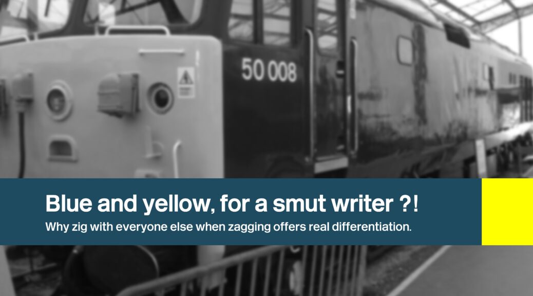
As you know, my series of sexy stories will be set all over the UK, involving trains, train journeys or stations to varying degrees: some perhaps only fleetingly while others more prominently. It was a nice way of finding a common thread for all these upcoming sexy stories. So, with tongue firmly in cheek, I chose the two colours associated with Britain’s railways for decades. Blue and yellow adorned British Rail’s locomotives from the 1960s to the 1980s. The colour scheme has a place in my heart as I fondly remember many family rail trips around Scotland and further south.


But as well as sentiment, there’s also the question of longevity. This livery lasted decades. It had staying power, a constant point of reference. And now? It feels as if the train operators seem to change on a yearly basis. Operators throw in the towel or they’ve been told to get lost for making such a balls up of running one of the franchises: hardly a source of inspiration or something to cling to.
Oh yes, and while these stories are associated with trains to varying degrees, the colour scheme doesn’t resemble that of a current operator. It’s a parody (not even a perfect colour match) comparable to an identity from decades ago and therefore not likely to irk anyone (and parody is accepted anyway).
So there you have it! You can decide for yourself just how smart or silly this decision has been. Time will tell. But I like to think I’m on the right track. What do you think?